[amazon_link asins=’B07BYLK7W9′ template=’AiPTProductAd’ store=’aiptcomics-20′ marketplace=’US’ link_id=’7d1c3e2d-4762-11e8-841f-b54b97bb34a2′]
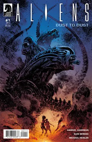
Aliens: Dust to Dust #1 kicks the series off smack in the middle of a Xenomorph attack on a human settlement and doesn’t let the action drop through the end of the issue. Does the issue feel like a good start to yet another edition of the Aliens universe?
It does! The series focuses on Maxon, who is awoken by the nighttime chaos the Xenomorphs are stirring up and in the first couple of pages we see his mother has had her face hugged and is carrying a Chestburster. Writer and line artist Gabriel Hardman uses the idea of a human host carrying a Chestburster in a really clever way and twists an oncoming tragedy into a situational boon when it comes to Maxon and his mom’s struggle to make it across a Xenomorph-infested town to a spaceport. Not only is the script packed with action, but opening with the Facehugger gives the reader an ongoing sense of dread so even as the characters navigate each obstacle, you never forget about that ticking timer that’s going to end in even more trouble. It’s a clever use of a Chestburster that I applaud Hardman for thinking up. I can’t say I care a ton about any of the characters yet beyond basic sympathy for horror genre victims, but with as action-packed an issue as this there really isn’t time for character development.

Applause is also due for this issue’s line art, which is all about the ink. There is a ton of black on every page and it immediately establishes a horror genre mood that carries throughout the issue. There’s so much texture all over the pages, from sweeping brush strokes to gooey black shadows on clothes and Xenomorph bodies. I also love the scattered, messy lines used to illustrate metal walls stained with splatter and fumes from the Xenomorphs’ acid-like blood. The inking work in this issue steals the show on every page.
Rain Beredo’s colors excel most when it comes to rendering light and Xenomorph blood. The gradients blend with the inking and textures in a way that makes the steam rising off a melting body look sickly and choking. Light-sources all burn like real flames with bright white centers that glow out into oranges and yellows that pop, but don’t overwhelm the page. There were a few coloring choices that felt a little too bright here and there, like an occasional bright blue that pops a little too much for the mood, but they’re smaller details that don’t distract from the rest of the art too much.

Michael Heisler kills the lettering of this issue. The way the first page’s “KAKAKA” travels in a line across the shooter and out of sight is so smart and though the font looks thick and bold there, the letters completely shift to fit every occasion. From messy, scratched up fonts for glass shattering to slimy, liquid-like letters for a tire going over a Facehugger, Heisler really uses all the tools in the box to make the effects really feel like they belong to each moment.
Overall, I’m very excited to see where this series goes. Even if every issue is nonstop action and we never learn a thing about the characters, if every page is rendered as gorgeously as this issue’s were, we’d still be getting a beautiful, terrifying Aliens comic. I can’t be mad about that at all.
Join the AIPT Patreon
Want to take our relationship to the next level? Become a patron today to gain access to exclusive perks, such as:
- ❌ Remove all ads on the website
- 💬 Join our Discord community, where we chat about the latest news and releases from everything we cover on AIPT
- 📗 Access to our monthly book club
- 📦 Get a physical trade paperback shipped to you every month
- 💥 And more!


You must be logged in to post a comment.