Most comic book fans have a pretty good idea of what they’re going to buy every week when they visit their local comic shop. With that said, there’s still a lot of fun to be had just glancing at the week’s new releases and taking a chance on a book that looks promising. That’s where covers come in-a fantastic image can make the difference between trying something new or saying, “Nah, not this week.”
In that spirit, here are the covers that captured contributor Madeleine Sisco and Manga Editor Eric Cline’s attention this week.
Madeleine’s Picks:
The Hellblazer #20
Art by Sean Phillips I’m a huge fan of Sean Phillips and this cover perfectly shows why. I love the texture within Huntress and the kind of washed-out feel the purple has. Her arms and fingers not being distinctly separated from the rest of the purple is haunting and John’s black tie draped over her fingers is striking. Great use of space and color to make a cover that grabs the eye.
Manifest Destiny #34
Art by Matthew Roberts This series has always had great covers; even before I binged it this past week I was always taken with the covers and their use of space and color. I chose this cover because I like how it’s a direct reversal of the very last panel in issue 33. The coloring of the snow-swept tundra and the sunset (sunrise?) in the background is gorgeous and the use of perspective with the guns is great.
Highest House #2
Art by Yuko Shimizu I will admit I haven’t read the first issue of this series yet, and don’t even know the basic premise, but this cover was too good to pass up. Covers that utilize upside down or duel perspectives are always some of my favorites, and this one’s rendering of the castle, and the scared expression of the protag work really well together. The color palette, as well as the spayed out hair of the protag like they’re hanging upside down all factor into my choice to pick this cover.
Eric’s Picks:
Doomsday Clock #4
Art by Gary Frank Mmm. Tasty. Reminds me of this classic video. I don’t really know what to say about this other than that Gary Frank draws yummy-looking pancakes. Delicious.
Lockjaw #2
Art by Matt Wilson This Matt Wilson cover is the epitome of fan-service. Hot, nearly naked man? Check. Gigantic, silly-looking Lockjaw, complete with drool? Check. Classic Savage Land background trappings? Check. Tens across the board.
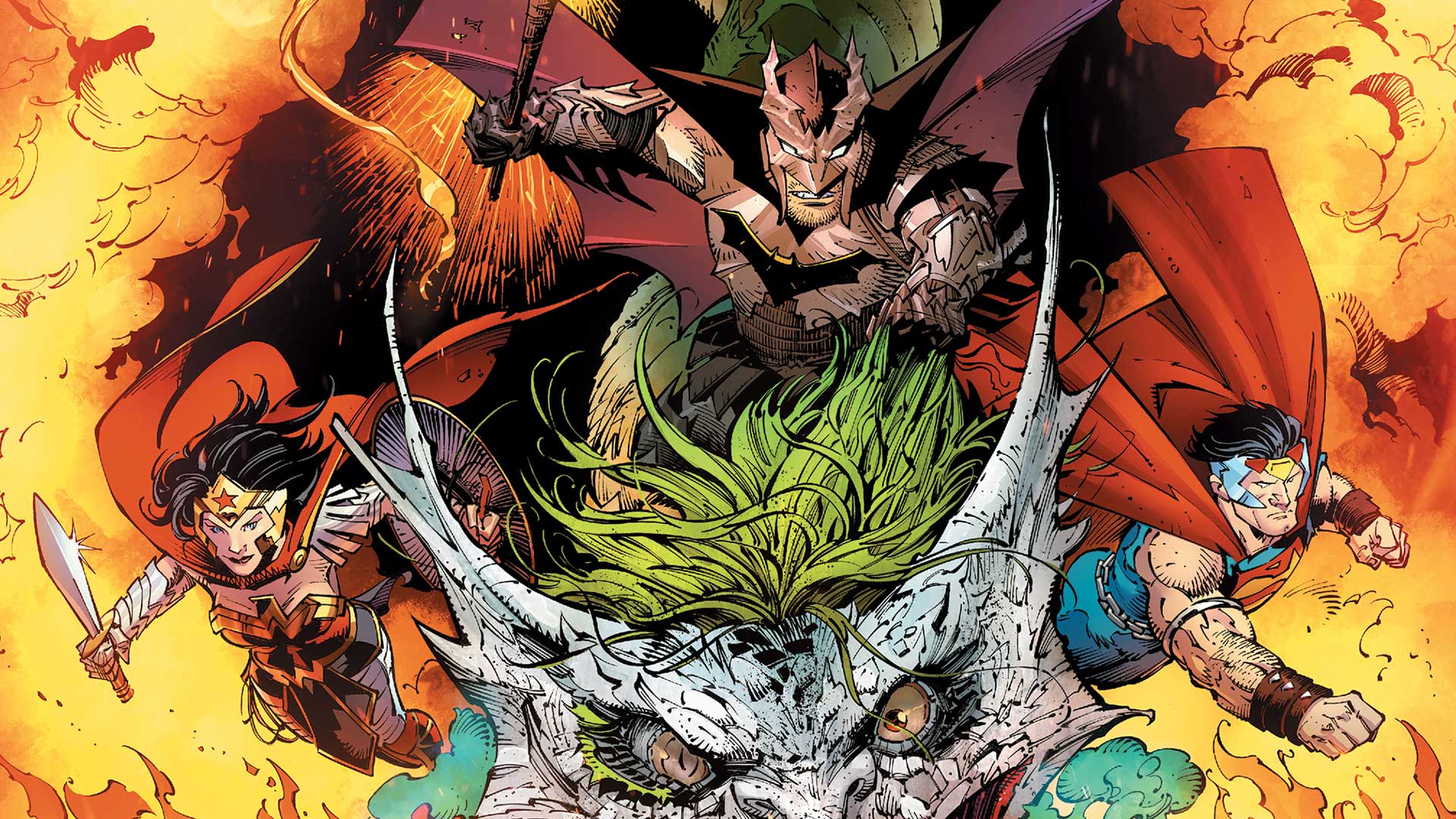
Dark Nights: Metal #6
Art by Greg Capullo & Jonathan Glapion

There are a lot of praise-worthy covers this week, but I can’t not shout out Greg Capullo and Jonathan Glapion on this one. This image has been running on ads for a few months now, and every time I see it I think that it’s the best image to come out of Metal. (It might also be, befittingly, one of the most metal comic book covers ever.)
The Joker dragon is absurd, but rendered so dramatically that I can’t not like it. I also love the armored-up depictions of the trinity here.
Do you agree with these picks? Let us know in the comment space below!
Join the AIPT Patreon
Want to take our relationship to the next level? Become a patron today to gain access to exclusive perks, such as:
- ❌ Remove all ads on the website
- 💬 Join our Discord community, where we chat about the latest news and releases from everything we cover on AIPT
- 📗 Access to our monthly book club
- 📦 Get a physical trade paperback shipped to you every month
- 💥 And more!


You must be logged in to post a comment.