Most comic book fans have a pretty good idea what they’re going to buy every week when they visit their local comic shop. With that said, there’s still a lot of fun to be had just glancing at the week’s new releases and taking a chance on a book that looks promising. That’s where covers come in-a fantastic image can make the difference between trying something new or saying, “Nah, not this week.”
In that spirit, here are the covers that captured contributor Max Sisco and Manga Editor Eric Cline’s attention this week.
Eric’s Picks:
Venom #3
Cover art by Ryan Stegman

His eyes, tongue, and spider insignia are all iconic, but my favorite of Venom’s motifs is his sharp set of teeth. It looks like he’s literally going to devour Spidey here. Speaking of Spidey, his small size in comparison to Venom amps up the sense of danger. This cover is also well-balanced, with a busy bottom half and more blank space at the top so the logo won’t cover up anything vital. Ryan Stegman continues to deliver work that’s better than Watchmen.
Moon Knight #196
Cover art by Becky Cloonan

This seems like such a logical concept for a Moon Knight cover, yet I’ve never seen an artist use it before. Moon Knight stories have always been focused on his mental health, and what better way to illustrate those cerebral conflicts than this? Becky Cloonan does a great job detailing all the folds of both the brain and Marc’s cape. This piece is a poster just waiting to be made.
Descender #31
Cover art by Dustin Nguyen

I don’t fully know what’s going on here, but I dig it. Dustin Nguyen is known for his lovely watercolor pieces, and he brings a strange, tense sense of vulnerability to this one. The boy’s face, possibly trapped, is haunting, and all the veins (or wires?) make the piece feel that much more delicate. The contrast between the light pink and deep violet is also stunning. Wow.
Max’s Picks:
Multiple Man #1
Cover art by Marcos Martin

The use of space and repetition are always something I appreciate in comics covers and this one makes use of it wonderfully. The title design is wonderful as well, and it fits Madrox so perfectly. I also really like the orange color, it’s rich and striking. Altogether a perfect cover that excels with its graphic design, making it eye-catching and almost forcing you to take a look at what’s inside.
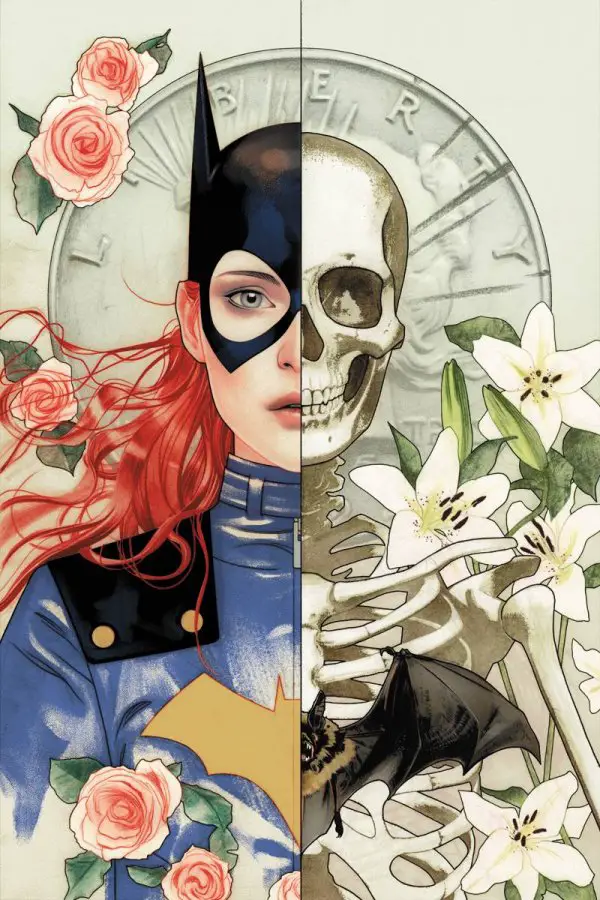
Batgirl #24
Cover art by Joshua Middleton

Wow. Just wow. This cover is genuinely one of the most beautiful comic covers, or art pieces in general, I’ve ever seen. Obviously it’s beautiful rendered as everything Middleton does is, but the symmetrical layout and use of roses on Barbara’s side and lily’s on the skeleton side is beautiful and thoughtful. It’s easy to use a lot of dual imagery in Two-Face stories but this might be one of the best uses of that theme.
Hal Jordan and the Green Lantern Corps #47
Cover art by Tyler Kirkham

This has obviously been a great week for comic covers, because this one is just as striking as the others I’ve chosen. I am a SUCKER for Atlas imagery in comics covers and this cover is so well rendered. I’ve been a huge fan of Kirkham’s variant covers for this series, as they’re all very simple but amazingly drawn and conceived.
Do you agree with these picks? Let us know in the comment space below!
Join the AIPT Patreon
Want to take our relationship to the next level? Become a patron today to gain access to exclusive perks, such as:
- ❌ Remove all ads on the website
- 💬 Join our Discord community, where we chat about the latest news and releases from everything we cover on AIPT
- 📗 Access to our monthly book club
- 📦 Get a physical trade paperback shipped to you every month
- 💥 And more!


You must be logged in to post a comment.