[amazon_link asins=’B07G8NHZDC’ template=’AiPTProductAd’ store=’aiptcomics-20′ marketplace=’US’ link_id=’6f73f03b-e7c6-11e8-ba88-9912981ad7d4′]
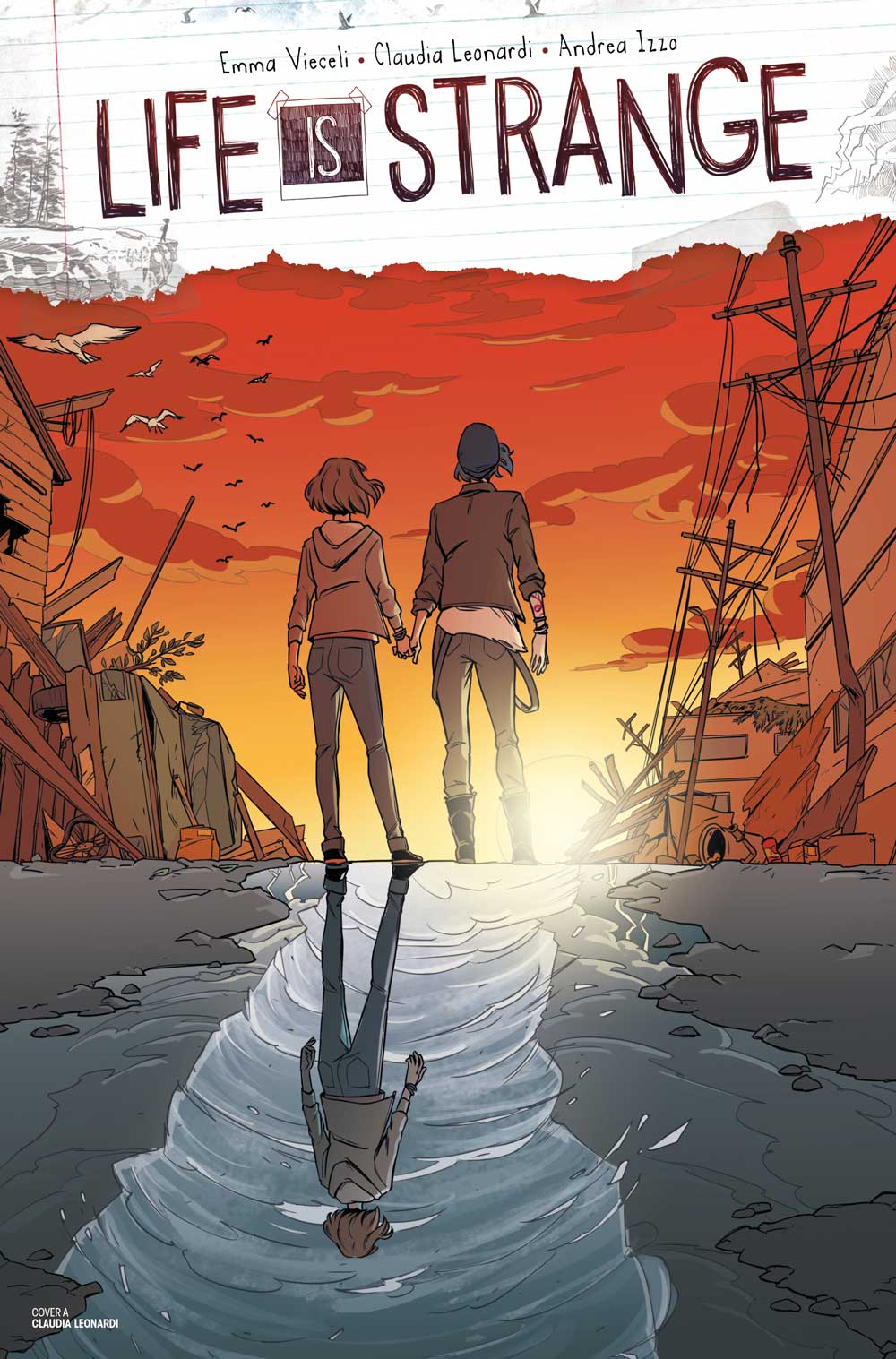
Life is Strange #1 picks up where the first Life is Strange game from developer Dontnod Entertainment left off, but with a catch. This series follows what happens to Max and Chloe after the end of the game and that phrasing alone should tell fans of the game which big ending choice the comic is following. If you’re a reader who has not played Life is Strange or hasn’t finished it and are concerned about spoilers, stop reading this review and go play that game! While this review will not have any major spoilers from the actual issue discussed, I will be referring to the ending of the game, so consider this a final warning before going into spoiler-territory. Does this new series offer a continuation worth telling or should the creators have chosen Arcadia Bay over the bae?
Writer Emma Vieceli reminded me how much I love and missed Max and Chloe. They capture the characters’ voices so well one would think the writers of the game were scripting them, except Vieceli manages to make them sound even more grounded and emotionally compelling. When the first “hella,” appeared in one of Chloe’s word balloons, I knew the scripts for the series were in good hands. Vieceli also adds a small ensemble of friends Max and Chloe make after leaving the ruins of Arcadia Bay which prove to be an immediately likable cast of characters that I hope get a generous amount of page time as the series progresses.

What I love most about the start of this series is that Vieceli’s script is deeply interested in the actual emotional ramifications of Max’s choice at the end of Life is Strange. Choosing to save Chloe’s life over saving the town of Arcadia Bay was hella romantic, but once one considers the human cost of that choice, it’s a frankly upsetting scenario. Vieceli keeps that human cost at the forefront of the emotional conflict of the issue as well as the injustice of Jefferson and Nathan’s crimes being literally washed away in the storm. There is an excellent balance in this issue of expressing and celebrating Max and Chloe’s feelings for one another while still considering the weight they both bear as survivors. The immediate conflict that drags those consequences to the forefront which Vieceli introduces is also very exciting and exactly on brand for the world of Life is Strange.
Claudia Leonardi’s pencils and inks for the issue fill the panels with little details to find that will remind readers who’ve played the game of all the quirky décor found around Arcadia Bay while showing readers new to the franchise a world that feels very lived in. From graffiti on bathroom walls to cluttered posters in a music venue, Leonardi gives the reader plenty to look at while also letting the environment help tell the story as life starts to get strange again. Leonardi manages to fill the panels with detail but never crowds the space with unnecessary lines and this less is more approach works especially well with their renderings of characters’ faces. A lot of emotion is conveyed with relatively few lines, with a lot of feeling being conveyed through the characters’ eyes. For a series featuring characters who tend to internalize their feelings often, it’s their expressions that sell what’s going on in their heads and Leonardi conveys those struggles well.
The color palette Andrea Izzo uses in this issue employs pastels in a way that feels warm even in scenes that use more blues and greens than reds or yellows. There’s a scene outside a music venue where all the nighttime blues help the glowing light from inside the venue windows pop out and give the space in the panel a lot of depth. On this particular page, Izzo even adds fuzzy rectangles of muted yellow to the ground in front of the windows and glass door to give the lighting and shading even more realism. This level of care and detail is carried through the issue’s color work and breaths even more life into Leonardi’s pencils and inks.

[amazon_link asins=’B07G8NHZDC’ template=’BottomAdAIPT’ store=’aiptcomics-20′ marketplace=’US’ link_id=’6f73f03b-e7c6-11e8-ba88-9912981ad7d4′]
Richard Starkings and Jimmy Betancourt are credited as lettering the issue and they play with fonts just enough to keep the issue feeling energetic without overwhelming the panel. If there’s one thing I think would make the series even more visually compelling, it’d be in the choice of layouts. Aside from one gorgeous page very early in the issue, the layouts throughout the issue feel very similar from page to page and don’t add a lot to the issue aside from a consistent enough pace. I’m hoping that as the conflict progresses and things get assumedly weirder, the team plays with the layouts a bit more too add more energy to the flow of the panels.
Overall, Life is Strange #1 has me very excited to see where the team takes Max and Chloe’s story now that it’s in their very capable hands. It’s clear they understand the emotional center that anchors this franchise of slang and quirky décor and time-travelling shenanigans. It’s clear that things are going to get weirder as the series progresses, and I am fully buckled in for the ride.
Join the AIPT Patreon
Want to take our relationship to the next level? Become a patron today to gain access to exclusive perks, such as:
- ❌ Remove all ads on the website
- 💬 Join our Discord community, where we chat about the latest news and releases from everything we cover on AIPT
- 📗 Access to our monthly book club
- 📦 Get a physical trade paperback shipped to you every month
- 💥 And more!


You must be logged in to post a comment.