Most comic book fans have a pretty good idea what they’re going to buy every week when they visit their local comic shop. With that said, there’s still a lot of fun to be had just glancing at the week’s new releases and taking a chance on a book that looks promising. That’s where covers come in. A fantastic image can make the difference between trying something new or saying, “Nah, not this week.”
In that spirit, here are the covers that captured contributor Trevor Richardson and Manga Editor Eric Cline’s attention this week.
Trevor’s Picks:
Die #3
Cover art by Stephanie Hans

Image Comics
I continue to be obsessed with Stephanie Hans’ work. I love her and Gillen’s idea for the “Grief Knight,” and the way Hans evokes that idea here is stunning. The way she renders the magic coming off the sword has a nice molten feeling and the colors really draw the eye. The knight’s expression also evokes Greek sculpture and sells the tone not only of the character, but the series overall.
Wolverine: The Long Night #2
Cover art by Rafael Albuquerque

Marvel Comics
Rafael Albuquerque is giving me the Wolverine I need. He’s feral, he looks scrappy, he looks like he needs a shower. The inks add just the right about of contrast to give the artwork a darker tone. There are just enough lines on his face to make him look angry without overcrowding the page. My favorite detail is the white used to render his breath in the cold.
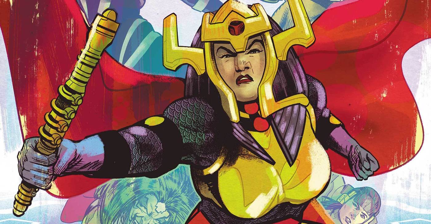
Female Furies #1
Cover art by Mitch Gerads

DC Comics
I’m so pleased we get more Fourth World art from Mitch Gerads after the end of his stellar Mister Miracle run. Throughout the whole run I was wishing for a Female Furies series and with Gerads on covers I got my wish with a cherry on top. His work on faces always blows me away and makes his Norman Rockwell influence known. Also, a male artist who can render women in a variety of ages and body types instead of using one cookie-cutter model traced from a porn magazine? A concept.
Eric’s Picks:
Tony Stark: Iron Man #8
Cover art by Alexander Lozano

Marvel Comics
Iron Man has had killer covers lately, and this one is no exception. The image of Tony, fully suited up and submerged in a glass, is initially attention-grabbing because it’s so unique and whimsical. When you think about in the context of the character, however, it takes on a somberness that infuses the everyday object with a level of danger no supervillain could ever generate. All in all, this cover works on several levels.
Prodigy #3
Cover art by Rafael Albuquerque

Image Comics
Any image where humans are made prey instead of predators tends to be quite striking, and there are few predators scarier than sharks. The shading here is fantastic; the contrasts between the lighter and darker values look great and help convey the scene’s perspective. The placement of the logo and creator names is also great: right in the top corner, not distracting from the gruesome scene at all. The man’s posing is great too– he’s really fighting back! Maybe this battle won’t go in the obvious direction after all.
Female Furies #1
Cover art by Mitch Gerads
DC Comics
This cover conveys exactly what I expect from this book: a group of strong women warriors ready to bash your skull in. The composition is good; none of the characters are encroaching on the others’ space too much, so your eye moves naturally from one to the next. Granny Goodness’ face in the background is an imposing reminder of where these characters come from, too.


You must be logged in to post a comment Login