The Forged is a sci-fi comic about an imperialist Navy and the strapping queer ladies who protect and serve it. Also, a mysterious scantily-clad mysterious woman who is mysterious. If someone described it to me in a vacuum, I would know it’s a Greg Rucka comic. That is a compliment.
Every ingredient that’s ever made up a Rucka comic is here. We’ve got a broken society built on capitalism and imperialism, we’ve got super soldiers upholding everything with their powerful bodies, queer women being talked down to by their male inferiors, crazy depressing future—it’s got it all. This bleeds Rucka in and out, and for someone who’s a fan of his, it’s like candy.
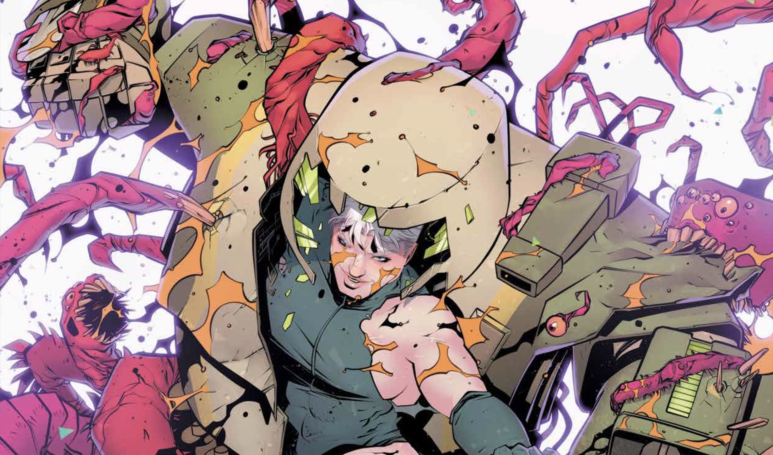
With everything present being more or less the same as it’s been presented before, what really stands out are the aesthetics, which sell the whole of The Forged in a way that enhances everything about it. While this book certainly has Rucka-forward flavors, the team surrounding him built something that stands out from the similar things he’s made.

The largeness of this book is a key choice that I think is a major part in the whole thing working. The ship, the mechs, the date, the map, and the space marines are all designed to produce a reaction of grandeur, an immaculate scale. This is even reflected in the comic, with 64 pages, nine double-page spreads, and a book that will be oversized when printed. This will be a comic I’ll go out of my way to get physically to bask in the giant art.
The magnitude of this comic is obvious and apparent at every turn, but it serves to communicate a lot about the setting. Obviously the year being in the 13,000s says one thing, the galactic map displaying the Empire’s land enhances and adds to that, but one of my favorite details is the ship’s design. It’s basically just a big rectangle, looks like a giant heavy brick being thrown through space. It isn’t sleek or sexy; it’s not meant to radiate wealth, or importance, just weight, maybe efficiency. This isn’t just an empire conquering worlds, it’s one with a bottom line, with little artistry.
All of this is reflected in the mechs, too – they aren’t Gundams with special weapons and finishers, they’re designed to fulfill a specified purpose in an assigned group. The simplicity implies a great deal about the society, and gestures at themes without being overly obvious. It creates a depth in an efficient and artful way that makes it easy for me to trust the series will continue to be engaging.
Something that I also found noteworthy has to do with the rest of The Forge’s design as a book—namely the info pages in the backmatter of the book—but also more broadly the way it wears its inspirations on its sleeve. It is impossible to read this comic and not understand that Rucka, Trautmann, and Henderson are huge sci-fi nerds, and a lot of this feels as whole as it does because they use shorthand that sci-fi readers/watchers/players are sure to understand. Stuff like The Expanse, Halo, and Mass Effect are at the fore to varying degrees, but what the design most replicates are RPGs, which makes sense, as that’s a big part of Trautmann’s creative background. The backmatter very much feels like a sourcebook in the best ways.
Across the board, though, this feels like a love letter to everything sci-fi from Star Wars to Warhammer 40K. It’s the kind of thoughtful action/sci-fi story that doesn’t lose track of its genres, but still manages to be about something.
Join the AIPT Patreon
Want to take our relationship to the next level? Become a patron today to gain access to exclusive perks, such as:
- ❌ Remove all ads on the website
- 💬 Join our Discord community, where we chat about the latest news and releases from everything we cover on AIPT
- 📗 Access to our monthly book club
- 📦 Get a physical trade paperback shipped to you every month
- 💥 And more!


You must be logged in to post a comment.