Most comic book fans have a pretty good idea what they’re going to buy every week when they visit their local comic shop. With that said, there’s still a lot of fun to be had just glancing at the week’s new releases and taking a chance on a book that looks promising. That’s where covers come in. A fantastic image can make the difference between trying something new or saying, “Nah, not this week.”
In that spirit, here are the covers that captured contributor Trevor Richardson and Manga Editor Eric Cline’s attention this week.
Trevor’s Picks:
DIE #4
Cover art by Stephanie Hans

Once again, the Stephanie Hans stan must jump out. What I love most about this cover is the contrasting color schemes used to show the difference in the game world versus the real world. The world of DIE is bleak as hell, but the soft blues here relax the eye. I love that the sweetness carries across into the game world, even if the dog becomes a mechanical beastie. These covers have excelled at giving you some insight into the character depicted and this one continues that trend.
Paper Girls #26
Cover art by Cliff Chiang

Apparently I’m in the mood for blue this week. Again, there’s a great contrast in this cover that makes the bubblegum pink pop really well. I know the series starts on Halloween, but this cover evokes the John Carpenter movie with the blade juxtaposed against the ooky spooky jack-o-lanterns. The inking here is also really strong, especially in the hair and eyebrow textures.
Red Sonja #2
Cover art by Christian Ward

I’ve always loved Christan Ward’s face work and the way he’s able to draw people without relying on one cookie-cutter body shape. He manages to convey a lot in the eyes with his drawings and this rendering of Red Sonja is no different. I love the fiery intensity in her face. The weapons emerging out of the splashing water give it the touch of magic I’ve come to love in Ward’s art.
Eric’s Picks:
Deadly Class #37
Cover art by Daniel Warren Johnson

Image Comics
This cover looks so great. Johnson’s work always has fantastic energy and this is no exception. The sense of depth and motion here is well-done, and I especially love the one ninja’s guts splayed out across that page. (How morbid of a sentence was that?) The colors here and bright and vibrant, making the scene a lot more fun to look at than if it was rendered solely in drab dark tones. The pinks and greens work especially well together. All in all, a great cover.
Eclipse #13
Cover art by Giovanni Timpano

Top Cow Productions
I love this image of sheer dilapidation. There’re so many tiny lines across the buildings and damaged cars, yet the scene still feels so empty and devoid of life. I don’t know what’s going on plot-wise, but this cover makes me curious to find out.
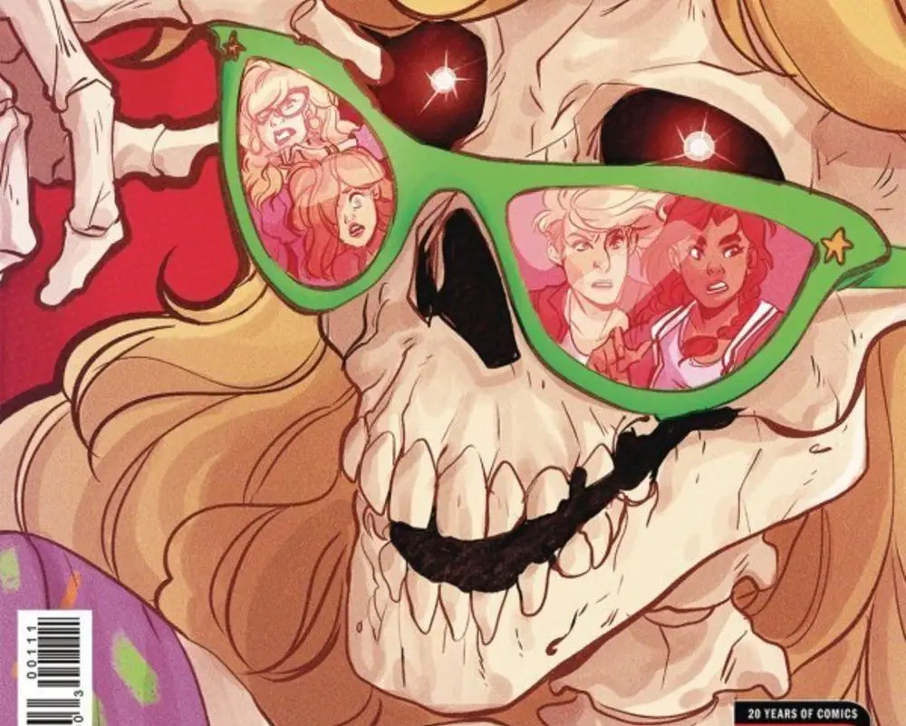
Morning in America #1
Cover art by Claudia Aguirre

Oni Press
This cover is so cute. It gives me major Goosebumps vibes, and I’ve always been a fan of skeletons dressed up like live people. The loose but still fairly detailed style is pleasing to look at, and the skeleton’s impression is a lot of fun. I really dig this.


You must be logged in to post a comment Login