

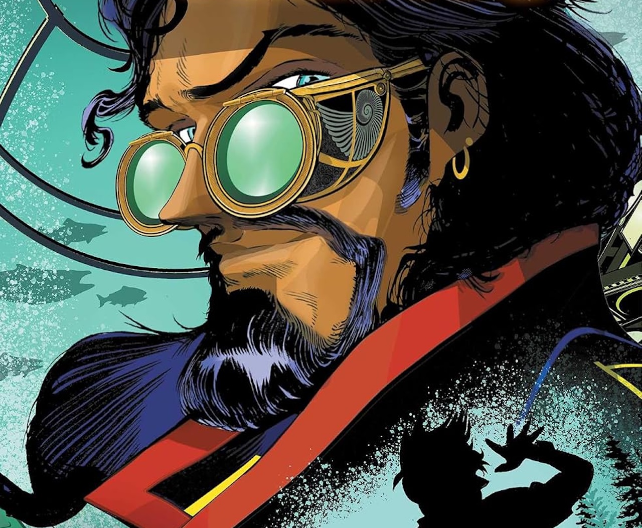

Mister Nemo #1, written by Mark London with art by Alden Kaye and colors by Alex Sinclair) is a new take on the classic Nemo character from 20,000 Leagues Under the Sea. Yes, it seems like every month there’s a new variation on the character from a multitude of publishers, but I think Mad Cave has a winner with this one.
Why? The story is set in the present, tossing aside the steampunk trappings and gauche politics of the Victorian Age, replacing it with something more immediate and visceral. The villains of the series are Unity Ultima, a global cadre of wealthy fascists wanting to turn everyone in the world into lowly workers for their factories. And if THAT doesn’t feel like a relatable and real concept to anyone living in 21st century America, then they’ve been in decades-long hibernation.
Also, Nemo and everything else in this first issue feels streamlined and edgy, similar to Benedict Cumberbatch’s Sherlock series, where an old stale character was dusted off and reworked into a dynamic, flawed modern hero, losing none of the features that once made them captivating.
Nemo even does the classic “hero’s landing” at one point in the issue, after vaulting into a room and taking out a few armed thugs, making him look more like Mission: Impossible’s Tom Cruise than Thomas Edison. He’s not a quiet philosophical guy, he’s a man of action, always carrying a loaded pistol and ready to take out a few UU henchmen with some bullets.

Mad Cave
The first few issues of the series will see Nemo collecting people to help in his crusade against Unity Ultima, while doing battle with UU in the Nautilus in all parts of the globe. Nemo’s first recruit is Dr. Petra Arronax, a brilliant IT expert who’s drawn the UU’s attention and her cold logical manner will be a great counterpoint to Nemo’s “fire first, ask questions later” approach. The two have a lovely Steed/Mrs. Peel-type dynamic. I love these “let’s get the band together” journeys and based on the issue’s intriguing cliffhanger, it sounds like additional members of Nemo’s crew are going to get much crazier.
Artist Alden Kaye’s design of the Nautilus is on point, looking sleek and massive like a combination of a Transformer and hammerhead shark. It has a rounded front and a barrage of viewports. Though we only get a teasing view of it this issue, it’ll be fun exploring its interior and seeing all the things it can do in future issues. Nemo’s look and design are equally good, with his finely-trimmed mustache and beard, dark spectacles and a peacoat that’s constantly blowing in the wind, looking any minute like he’ll take flight into the sky.
Like all great first issues, Mister Nemo #1 sets up the story perfectly, presenting lots of questions and tantalizingly few answers. But what’s Nemo without some mystery?




You must be logged in to post a comment.