


Most comic book fans have a solid idea about what they’re going to buy every week as they descend upon their local comic shop. With that said, there’s still a lot of fun to be had just glancing at the week’s new releases and taking a chance on a book that looks promising, funny, scary, etc. That’s where covers come in. A fantastic image can make the difference between trying something new or saying, “Nah, not this week.”
In that spirit, here are the covers that captured our attention this week, with entries from comics editor Chris Coplan. This is Judging by the Cover.
Absolute Wonder Woman #22
Cover by Hayden Sherman and Jordie Bellaire

Have you noticed that modern fiction has an obsession with giant swords? And, look, I get it: When it comes to tropes, you can’t get more simple and effective than a giant instrument of death that’d make even Robert Wadlow look like a short king. But there’s also some clear downsides here; try as you may, the decidedly phallic nature of these weapons often stymies pieces/stories to an extent. That’s why I really like what Hayden Sherman and Jordie Bellaire have done with the cover to Absolute Wonder Woman #22. Diana’s larger sword is even grander than ever, to the point her dragging it on the field is this epic demonstration of her power as well as the intensity of the battle to come. But there’s always a bigger bomb (as I alone now say), and this “impossible mythological force” wields a trident that would give a complex to some football fields. So, then, what’s it all mean? Well, it works on a few levels. One, never assume you’re the biggest and the baddest in anything; that’s how you get hurt. Secondly, it proves that Diana has to be so much more than her weapons, and her personal arc will continue to be about finding a power that doesn’t always reside in “traditional” forms. And, thirdly, big swords are still cool, but you can be a badass (like Circe) even without one. Talk about some real cutting insights, yeah?
The Amazing Spider-Man #33
Cover by Ed McGuinness and Marcio Menyz

Among this column’s many interests, Spider-Man’s penchant for suffering is clearly right up there. (Also up there? Stealth puns galore.) But occasionally it’s not enough to see Spidey get beaten down and broken (even as that remains a great kind of existential release for our own daily problems and complaints). No, we’ve got to see not just how Peter Parker takes his beatings, but how he can overcome the pain and suffering in any given moment to really transcend as both a person and a hero. Cue this primo cover to The Amazing Spider-Man #33 from Ed McGuinness and Marcio Menyz. In an issue that’s supposed to involve Damage Control and “fight clean-ups,” it’s great to see Spidey either mid-battle, bracing the very earth on his back, or showing the kind of effectiveness I’d like to apply to simply cleaning my apartment. It’s an image that also works a couple levels: It is Spidey struggling but making it work regardless, or finding that space between pain and perseverance, strength and struggle. It’s a snapshot of the very thin space Spidey can best occupy, and how he finds the power (and, based on that slight smirk, perhaps even some joy) in his especially unique lot in life. The only thing wrong here? He should’ve lifted with his legs, not his back.
Sicko #1
Cover by Amilcar Pinna

Sometimes great stories are aided by the circumstances of their release. Case in point: Sicko. With a story about a medical student who is “forced to weaponize her immune system,” coming out amid an outbreak of the cyclospora parasite is timing that is some combination of brilliant and utterly awful. But even if we didn’t have that handy bit of timeliness, series/cover artist Amilcar Pinna really delivers with issue #1. The translation of the premise here is great; you can almost feel like her blood is being wielded like a true projectile weapon (like Magneto and those little bits of iron in X-Men 2). I also quite “enjoy” the particular suffering experienced by the men in hazmat suits; it’s not overly gross or bloody, but it feels really genuine in its scope and intent. But, of course, the piece de resistance of this cover is the sickly hue of that flashlight and the particular angle of the hallway — it almost makes me feel sick to my stomach (with anxiety, terror, etc.), and that feels like the most effective way to really bring me into this story full bore. All of that “wonderful” context and great art have combined forces to make one thing clear: Sicko is one bug I don’t mind catching this summer.
Star Trek: Red Shirts – Ghost of the 21st Century #1
Variant cover by Chris Burnham

When Christopher Cantwell and Megan Levens launched Red Shirts in 2025, it was somewhat measured. The team still tore through those disposable heroes with true intent, but the story also felt a little more deliberate in its tone to examine what Red Shirts represent (and not just sending them into increasingly elaborate Rube Goldberg-esque “machines” of human suffering). But I think this next chapter will lean a bit more overt and intentful with its use of violence (and not just because it’s written by Gerry Duggan and features the tagline “Red Shirts don’t just die — they’re used”). Because any title that proudly boasts this awesome Chris Burnham variant cover to its debut is clearly no longer playing any games whatsoever. And even as someone who loves gore (like beavers love making dams!), even I’m a little unsettled at A) intestines that open like sewer tunnels; B) the single tooth and thumb combo; and C) the way the Federation insignia is regarded here. Sure, I’m high on this uber bloody supply, but it’s tempered with some uneven sentiments and doubt. And that to me is what connects these two chapters: Even if the violence is turned up to 11, it still makes us grapple with the bigger questions of humanity and how we see Red Shirts in comparison to ourselves and others. And, in turn, that raises some big Qs about empathy, community, and what we’re actually willing to sacrifice for progress (coughAIcough). It’s a true gut shot, if ya catch my meaning.
Mind MGMT: New & Improved #2
Variant cover by Jenna Cha

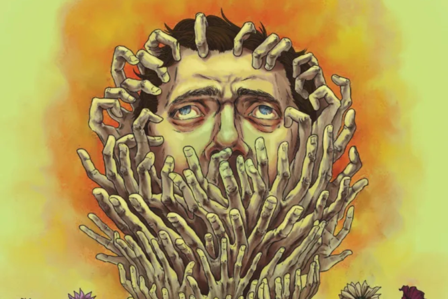
I don’t know Jenna Cha, but I think she and I would be simpatico. I’ve been thinking about her variant cover for Mind MGMT: New & Improved #1 for quite some time; there was something about that deeply confrontational, mega uncomfortable cover that spoke to the heart of what Matt Kindt was doing this time around. (Which was mostly commenting on our current moment via the weird lens of all things Mind MGMT.) And while I also quite like Cha’s cover for issue #2, it wasn’t until I found out this chapter takes place in my home of Phoenix, Arizona that I knew I had to choose it. I don’t know if Cha has ever been to the Copper State, but this pretty much nails it: the weird configuration of nature (that hand tree feels a lot like a cactus); the way the outside can feel absolutely claustrophobic; the glory and the terror of the “sun”; and even just our weird sense of community here (it’s not exactly like cloying hands all over your face, but if you know then you know). Hey, not only did I just describe my hometown pretty accurately, but I think I touched on some of the same energies and themes of this latest series. (Also, it feels in line with the overarching “approach” of the book itself.) Really great art can make you feel like you know even a perfect stranger, and I can’t wait for how Cha uses any subsequent variant covers as an “introduction.”
Dungeons & Dragons: Total Party Killers #1
Variant cover by Michael Walsh

While I’m jazzed that places like Dropout have helped usher in a kind of D&D renaissance, I’m not all that familiar with the “game.” I’m only aware of “TPK” because it’s a mostly effective-looking wrestling finisher. That said, Total Party Killers seems like it could be the thing that gets me more interested. Not only cause there’s apparently a “gelatinous cube wizard” and “werewolf rogue,” but it’ll be dope if it’s even 13% as cool as this Michael Walsh variant cover to issue #1. If we’re going to have a story about a squad of monsters, I like the variety promised by Cthulhu-esque squid man and a skull warrior ripped from, say, Heavy Metal. It also feels reminiscent of all the parts I recognize about D&D (i.e., giant eyeball monster dude!) but in a way that wouldn’t be so boring or tedious for seasoned aficionados. Meanwhile, the character designs feel the right amount of “modern” or “updated”; maybe they’re different than what you’d expect from the D&D canon but also very much in line, and the end result balances nostalgia with innovation. There’s even some “feelings” of certain energies and influences — there’s a kind of punk-ish delight and a manga-esque sheen that makes me even more stoked. If this is the book that does make me a D&D Head (a D&Der?), who will let me play as an incompetent undead wizard?
X-Men: The Hellfire Murder #1
Cover by Luciano Vecchio and Edgar Delgado

With Krakoa long gone (RIP), and Marvel likely to experience some big changes in the near future, we have to really hold on to the gems — the Hellfire Gala most of all. But this time around, the biggest mutant party of the year gets an added twist with a murder-mystery theme, with Jubilee and Wolverine playing Sherlock and Watson. (Who occupies which role is up to you, dear reader.) But while I’m jazzed for a kitschy little gimmick, Hellfire is always about the outfits, and so I have to do my best to channel J. Alexander. Whoever decided to put Wolverine in an all-fur outfit deserves a raise; he looks like a bear in a gimp suit and I love it dearly. Meanwhile, Jubilee looks decidedly class, and I love that she gets to play grown-up more and more because frankly she deserves it. From there, Psylocke in a butterfly mask is so on the nose that it’s got nostrils, but then I can excuse a little obviousness if looks this good. And, really, that’s the only people worthy of mentioning — just kidding, take a look at Cyclops. I’d say the leather thing doesn’t work with everyone’s favorite Adult Boy Scout, but the man has enough grit and edge to make it work. (And by it, I mean “Sexy panther with a 12-pack ab.”) The Gala is ultimately about having stupid, flirty fun, and even if it’s “dressed up” with a mystery component, we should embrace this moment for what it represents with gusto. Still, though, I’d hate to have to dry clean Logan’s suit.
Terminal #1
Cover(s) by Andy Kubert

Am I an idiot? Maybe; I used to wash dishes with cold water. But in this instance, I’d say I’m ahead of the curve in a way. Because, yes, I know these two Andy Kubert-Dave McCaig covers aren’t mean to be joined together. (You can find the full/actual covers over on Image’s website.) That said, I’m not simply star-struck that a genuine A-list group of creators (Kubert alongside Robert Kirkman and Joe Casey) have united for what’s already been heralded as the “series of the year” (even if that’s just from Image). I also see what this is really all about: A chance for some leading comics characters to further revisit the ’90s jungle of over-the-top hero comics to try to make their mark via nostalgia and a strategic repurposing. So, I figured I’d get in on the action and hastily assemble my own “cover.” So, aside from clearly mucking up basic spatial stuff and lining up two mismatched body parts, what have I actually done? Well, I mostly did a thing I wanted to see, which in a story about “two violent forces with superhuman abilities who blur the lines between good and evil,” was bring said sides together and get ’em at each other’s necks. Do I know anymore about the book on any level after this artistic mayhem? Not really, but one thing is clear: I sort of like my cover. Not because it’s good, but because it’s got my fingerprints on it, and that’s what I actually want — a bunch of pros making this not another feckless rehash but something with teeth and spirit, that honors its origins and still paves the way toward new ideas and insights. Will they accomplish it? IDK, I’m just a big dum-dum.
Detective Comics #1111
Variant cover by Carmine Di Giandomenico

I almost picked Mikel Janín’s main cover, but then I chose otherwise. Because while it’s quite good, I quickly took issue with the “tagline” of “The Bird, the Bat, and the Arrow.” Like, sure, it’s accurate, but it doesn’t flow, isn’t really all that catchy, and I frankly couldn’t done better. (What about “The Bird, The Bat, and The Billion-Dollar Beard?” We can workshop it, obviously.) I only mention that because I immediately forgot all about those “problems” when I peeped this excellent Carmine Di Giandomenico variant cover. It is, to paraphrase Scottish alt rockers Del Amitri, everything I hope it’d be: a graceful, endlessly forceful Batman, a spry and feisty Black Canary, and, frankly, a bit of genius offense from Green Arrow. It’s so rich and stylized, the perfect snapshot of the singular majesty and grit of Gotham City, and I can practically feel the G-force being applied to our heroes. But everyone also gets to stand on their own two feet (or not precisely — you know what I mean), with each movement screaming everything you need to know about this trio. I’d go so far as to say it does what “The Bird, the Bat, and the Arrow” intended to all along: an undeniable snapshot of these three, with style and action a plenty. Turns out all words fail in the face of urban swan dives.



You must be logged in to post a comment.