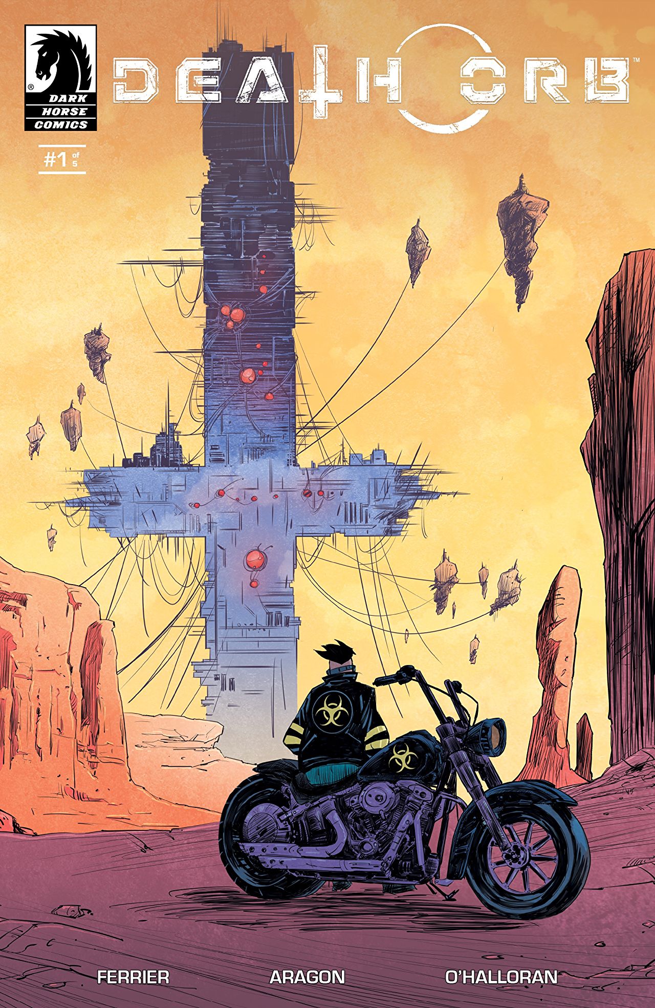
Massive crucifix-shaped towers, sleek leather dusters, axes, and indomitable motorcycles tearing down dusty roadways — Death Orb from writer Ryan Ferrier and artist Alejandro Aragon looks, and even feels, amazing. It’s unfortunate that its staying power, then, is entirely in its aesthetic while the narrative tags along an unfocused, uncompromising jumble of ideas and plot-lines.

What’s it all about? Dark Horse’s preview reads:
Rider, an ax-wielding wasteland survivor, carves a bloody path across a war-torn North America ruled over by the Lords, the mysterious Father, and their cult followers as he searches for his abducted wife and child. Information from one of Father’s hired mercenaries could lead Rider to his family–if the Lords don’t take him out first.
For my money? That’s a compelling plot, especially if it gets me admission to the incredible, absolutely skull crushing high-octane heavy metal world that this story takes place in. However, most of those details aren’t touched on or explicitly stated in this first, an introductory, issue. Instead, Ferrier’s plot leaves us to fill in a lot of the details — skipping between beats in a confusing manner and dropping us into the middle of scenes rife with dialogue and vernacular that feels foreign but not contextualized, as if we missed something. It’s a demanding, often alienating, read that seems to be going for keeping things entrenched in mystery and raising the stakes but would’ve been better off establishing them first.

Dark Horse Comics
Where the narrative is less focused, though, the artistic aesthetic here is an entirely honed and brutally fun affair. Intentionally fragmentary, sketched, fluid and rough all at once, these pages are alive with a brash energy that leans the book hard into its “Mad Max meets every good heavy metal music video” inspirations in the best of ways. Aragon on pencils and Chris O’Halloran on colors is a good combination, too. Where another colorist might lean too hard into the dark aspects of both the narrative and line-work here, O’Halloran instead injects the book with some vivid, varied, blues, oranges, reds, and yellows that not only work as individual elements but also set entire page’s color tones in a satisfying way that conveys presence, meaning, and energy. It’s entirely effective and most importantly, fun in a way that will at the very least bring me back the second issue.
In the end, what we have is a bit of a mixed bag. Death Orb isn’t entirely successful here in its first outing. It most noticeably stumbles in setting up an expansive world with stakes and characters we care about in favor of creating a wide but shallow puddle, but, does succeed wholeheartedly in selling that same world so well visually through the singular execution of its unique vision. Here’s hoping the second issue shapes things into focus.
Join the AIPT Patreon
Want to take our relationship to the next level? Become a patron today to gain access to exclusive perks, such as:
- ❌ Remove all ads on the website
- 💬 Join our Discord community, where we chat about the latest news and releases from everything we cover on AIPT
- 📗 Access to our monthly book club
- 📦 Get a physical trade paperback shipped to you every month
- 💥 And more!


You must be logged in to post a comment.