



Most comic book fans have a solid idea about what they’re going to buy every week as they descend upon their local comic shop. With that said, there’s still a lot of fun to be had just glancing at the week’s new releases and taking a chance on a book that looks promising, funny, scary, etc. That’s where covers come in. A fantastic image can make the difference between trying something new or saying, “Nah, not this week.”

In that spirit, here are the covers that captured our attention this week, with entries from comics editor Chris Coplan. This is Judging by the Cover.
Batman / Superman: World’s Finest 2026 Annual #1
Variant cover by Rahzzah

At some point (either a week ago or in May 2024), I picked a Batman / Superman cover for its stark depiction of the Super BFFs. Because while their partnership/bromance has been depicted 1 million times over, the best covers/stories still provide some insight if you know how and where to look. Case in point: this extra wholesome scene depicted by Rahzzah for this World’s Finest 2026 Annual. Now, if you were so inclined, you could simply indulge in the cutesy, down-home vibes, and this slice of pure Normal Rockwell-ian nostalgia would fill you up like ma’s pecan pie. (Also, Batman in a robe will never not be both adorable and hilarious.) But look a little deeper: Bats’ torn suit and Superman’s head wound, and how they’ve clearly just been through something; the vintage costumes themselves, and how those associations mean something in our consumption; the fact that Bruce hasn’t removed his cowl, and what that may or may not say; and, of course, that pregnant smirk from Bats. It’s as much a heartwarming slice of comics-centric Americana as it is with a scene with contextual layers, and your experience is ultimately a reflection of how deep you look into the World’s Finest pairing. The only real thing that I can’t wrap my head around? Why that sweet bobble collection isn’t more prominently featured.
Queen in Black #1
Variant cover by Peach Momoko

Here’s why I’m jazzed about Queen in Black: it throws off the usual formula. Which is to say, instead of good versus evil, it’s really evil versus evil versus good. Or, it could eventually be good and evil versus evil, or even evil and evil versus good. Really, there’s a lot of directions to go, and a good event should have more legs than “we must stop this one galactic threat!” That sense of openness is exactly why I love this Peach Momoko variant to issue #1. First and foremost, Momoko always has an interesting perspective on most characters, and she’s able to recast them in a way that fits a specific storyline while also feeling a different level of offputting, intense, charming, etc. to extend your viewing experience. In the case of Hela, I’m somehow drawn even more to that face than the symbiote-ification going on. (The rest of her looks like she started a Resident Evil-themed Slipknot cover band.) Is that the mug of someone who has been warped by the horrors of fresh war? Is it the kisser of someone lost deep in fantasies of blood and chaos? Is it the visage of a monstrous soul, or someone with just enough light left in them? Is it the pan of a winner or a loser or something altogether more exciting/terrifying? It really could go either way for me, and that’s more exciting than any hero versus symbiote battle. Because these events are sometimes predictable, and if they can take that away, then they’ve already won. Still, I’m watching you, Hela.
The Patron #1
Variant cover by John Pearson

When I spoke to Christian Ward recently about The Patron, one of the things that stuck with me was his friendship with artist/co-creator John Pearson. You want that camaraderie among all creative teams, but Ward seemed extra pleased for the opportunity to not only work out personal/professional ideas and feelings with his cohort, but give Pearson a chance to really stretch his artistic wings. (And those were already some mighty impressive wings, let me tell you.) Pearson’s own variant cover to issue #1 is proof of said connection and trust. For one, this patchwork of styles is just a big, bold flex from an artist that more than deserves to boast that much. At the same time, that decision isn’t just super cool: In a book about a patron murdering artists to boost their fame, I think it’s 1) a commentary about the nature of being a working artist and 2) does heaps for contextualizing our killer in one striking image. (I think using pieces like Starry Night and The Scream send a very specific message without being so overt about it.) And there’s more stuff, too — the patchwork approach is also a great symbol for the murder mystery within, and we might understand the victims through the paintings referenced. Either way, it’s a quick, impactful masterclass from Pearson, and why this book already feels so lively and vital.
The Dirt Beneath the Devil #1
Variant cover by Mark Chiarello

I see a lot of premises detailed in a lot of solicitations, but The Dirt Beneath the Devil has piqued my interest: “In the dying days of the American frontier, a young woman journeys into the unknown to claim a legacy she never asked for — and may not survive.” Right there you’ve got horror, cowboys, daddy issues, and perhaps one of my favorite tropes ever, a journey by wagon. And this Mark Chiarello variant cover manages to take that interest and increase by no less than 27% percent. Our heroine (Jane) looks a little like Jessica Chastain, and even if it’s not intended that way, such an association (a famous actor in a western) generates the kind of giddy attention any new book demands. The marriage of black and orange, meanwhile, fosters both a sense of fear and this oddly-tinged nostalgia, an aesthetic that fits perfectly with the vibe and themes of the core story. The quaint-ish vibes of the buildings even do much of the same; I feel like I’m looking at old paintings even as there’s this clear sense that something is a teeny bit off. Even the gun and horse combo may be a little cliche, but you can’t deny the power of a little familiarity in bringing you into the story (at which point you hope there’s more there aside from just another western). I expect something with enough action, historical accuracy, and era-appropriate drama, all done with style and flair. Throw in a shootout or two, and maybe we’ll really have something.
The Toxic Avenger #10
Cover by Fred Harper

I’ve spent a lot of time consuming and dissecting Fred Harper’s work on the various Toxic Avenger projects. And I think that while I may prefer the more cartoonish spin of Tristan Wright, there’s little denying that Harper has maintained an especially inventive and important take on Toxie. As exemplified by the cover of Toxic Avenger Comics #10 (the end of the “Toxie Goes to Washington”) storyline, Harper makes our favorite radioactive hero look like lumpy mashed potatoes fixed atop a Duke Nukem action figure, and I say that as a supreme compliment. Because in a story about a mutant good guy, the worse looking he is, the more this franchises’ thematic gold can really shine through. But what strikes me most about this cover is the, um, sheer intimacy between Toxie and his robot enemy. Even divorced from the actual story context, it’s an image of extreme proximity that really sets big hero-villain fights squarely on its head. It’s frankly a bit sleek and sensual, and that specific intent and framework in this particular story world is massively effective in its efforts to throw us off and get us reexamining this whole sordid tale. It’s yet another way that Harper is the perfect artist for this run, and how he uses things both disgusting and alluring to poke our brains, disarm our preconceived notions, and lend new power and layers to Toxie. All in all, it’s a great way to wrap up this little vacation.
Only The Savage Are Left #2
Cover by Stefano Raffaele

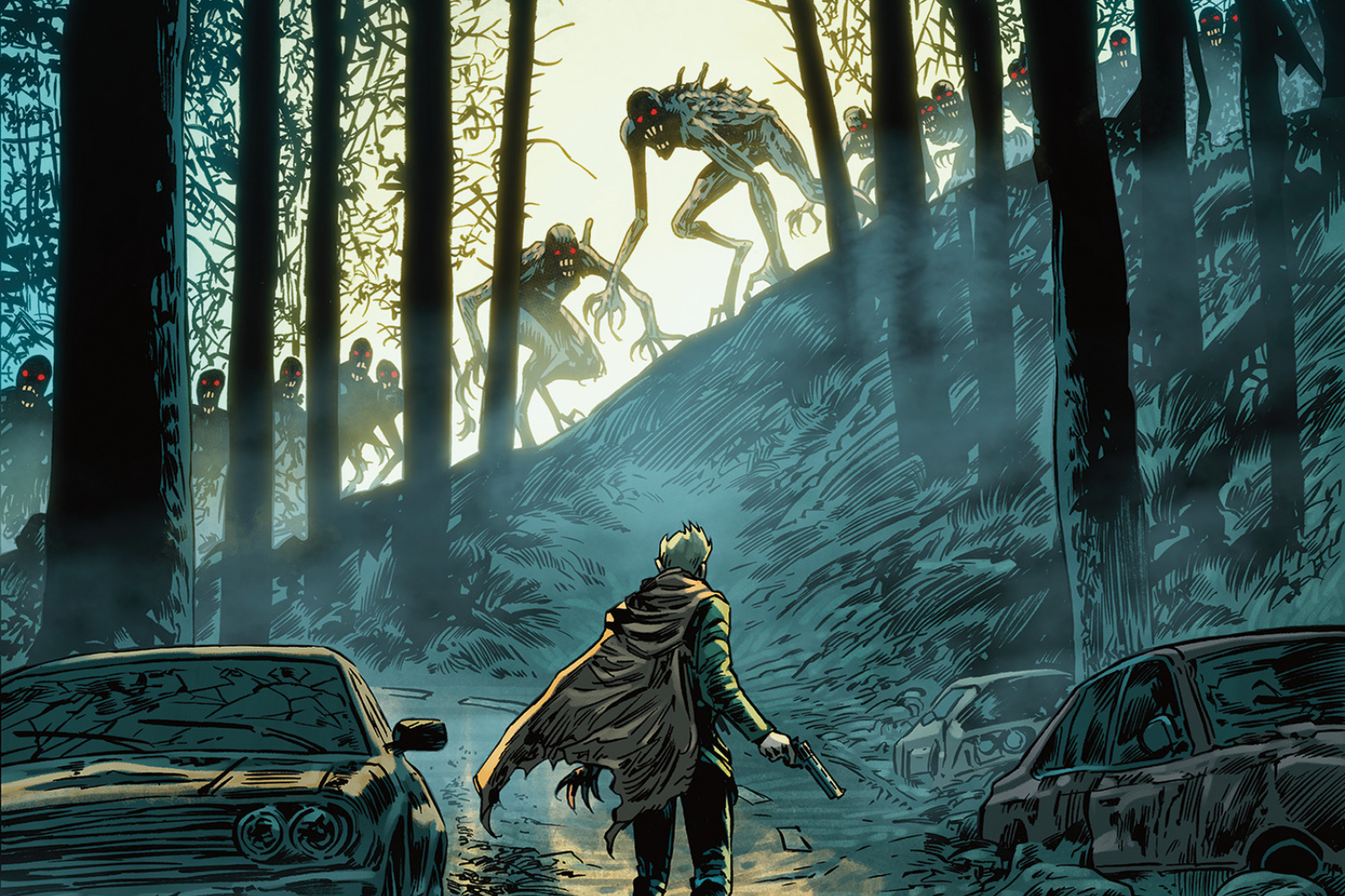
Listen: I may be a little dumb and overly verbose, but I’m also a rebel and a loner. I go against the grain — unless that’s what someone would want me to do, then I double, nay triple down on the grain. So when I first saw Stefano Raffaele’s cover for Only The Savage Are Left #2, I know they want me to feel this great swell of fear as our hero faces his former human cohorts who have now become rage monsters. (I mean, it’s a little more complicated than that, but if this image stokes similar feelings of your traditional zombie fiction, then you’re in the right neighborhood.) But instead I feel a great swell of hope, this undeniable sense that things are as they will be and that I can accept that somehow. Maybe it’s the way the light frames the monsters, lending them an almost angelic quality. (Well, biblically accurate angels, at least.) It could be the serene quality of the surrounding area, which hums with a winter-esque quiet. Or the fact that said hero seems just as much awestruck as he is ready to fight. Even the way the road stops but doesn’t seem to “end,” and what that ultimately says about ideas of life and destiny. Either way, it makes me feel like the inevitability of fate, or that there’s a conclusion to all things. Maybe you can fight it (but should you?), and that said gesture is only ever for one person and their sense of self. You can’t deny the future, and one day it’ll come at you with all its wonders and horrors. Not exactly the best attitude for an action comic, but these little flares of something else are why these stories really matter.
Rocket Raccoon: Rocket Rewind #1
Variant cover by Mike Mignola

Look, I for one am very glad that Mike Mignola likely spends his days drawing whatever weird creatures he dreams up. But every once in a while (and seemingly with more frequency these days), I like to see him return to comics fold and draw something for someone else. And boy oh boy has he really done a number with this Rocket Raccoon piece. I love the fact that this Rocket sits in the center space between “realistic raccoon from your AP bio textbook” and “raccoon from an MTV cartoon circa 1997.” There’s also the right amount of retro sci-fi magic to his suit and that gun, both of which look like they could’ve been featured in an alternate version of Lost In Space or something. Also, the fact that he’s underwater and it’s a teensy bit hard to tell feels like something you’d expect from an appropriately referenced sci-fi TV show from 1968 call like “Space League” or “Adventures in the Cosmos!” But above it all, Mignola’s vibes (and his monster designs, of course) are exactly in his wheelhouse, maintaining his aesthetic to just the right level. In a celebration of 50 years of Rocket stories, it’s a generally perfect cover — the right kind of nostalgic mixed with the right amount of new and weird to maintain Rocket’s past and future in perfect alignment. Go Rocket go!
DC’s Hawk-Girl Summer #1
Variant cover by Lesley “Leirix” Li

Speaking of throwback magic, Lesley “Leirix” Li’s is the perfect choice for DC’s Hawk-Girl Summer #1. Because any other time of the year, I’d say marrying the Bat Family with, say, Beach Blanket Bingo would be an idea so depressing that I’d set fire to a small kiosk or something. But it’s summer, and that means even more themed DC anthology issues, and that requires ample amounts of fun. And fun is exactly what this cover has: the fact that they actually made (or bought?) a Bat-themed blanket; that you can identify each member just by the smallest clothing details (very brave to broadcast your hero identity, Jason); Barbara’s totally great bikini (more suits with bling, please); that single, perfect starfish; and even the fact that Batman maintains a presence via a sand sculpture (a genuinely perfect touch as he wouldn’t touch a beach unless there was a double homicide). These issues are about dropping pretext and all that noise and letting characters cut loose, and the Bat Family is the most effective subject for this kind of catharsis. The best work around these “holiday specials” makes you see your faves in a new light, and realize that it’s not the suits, powers, stories, etc. that makes you connect with them but rather that simple humanity that just wants to enjoy a few moments in the sun. Sure, it’s 1,000 degrees out everywhere, but this is the kind of pure joy we should be having more in comics.
Black Star #1
Variant cover by Joe Bocardo

Black Star could just be know as a “Northern Gothic Noir tinged with horror and dark humor.” Or, the book penned by Kristin Kreuk (who starred in two separate 2000s standouts in Smallville and EuroTrip). But more than such hype associated with those identifiers, I want to make sure it’s know for the art and execution, because based on this variant cover by series artist Joe Bocardo, we’ve got a cold-blooded crime story awaiting. Admittedly, the whole “dueling reflection” trope can feel a touch overdone, but in a world where a dude discovers he’s not the only one with magic powers, it messes with your head in a new way while hinting at ideas of identity and this interesting sense of dichotomy. As for depicting the early 19th century fur trade (because magic users ain’t enough these days), Bocardo keeps it simple and direct, never over-relying on visual tropes to make the setting feel hokey. And speaking of hokey, is that a cityscape we see? Again, the meeting of past and present has been done, but the subtle, understated placement of this skyline tells me the mystery and adventure might be a slow-burner over something more overt and in-your-face. And if absolutely nothing else, this kind of extreme-ish weather always makes for a great mystery setting. Hey, Black Star, so far you’ve nearly earned that gold star.


You must be logged in to post a comment.